For a refreshing reminder of the mendacity of the cultural left, look no further than PZ Myers' recent post on the consequences of the sexual revolution.
Myers takes umbrage at a "militant Catholic" (Patrick Fagan of the Family Research Council), who observes:
Myers demurs. He insists:

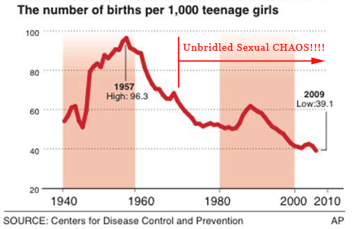
Hmmm. Why did Myers pick teenage births, rather than, say, teenage pregnancies?
Something's odd. So how to explain Myers' graph?
First of all, marriage rates were higher pre-1960, and people married considerably younger than they do today. The spike from 1945 to 1960 is the Baby Boom. A 19 year old married woman having a child by her husband (not an uncommon event in 1955) would show up on the graph. That is not the same kind of "teenage birth" one commonly encounters in 2013, which is nearly always an unmarried teen girl who commonly doesn't even know which of her 'hook-ups' is the father.
Second, no one in their right mind thinks that teenage pregnancies declined in frequency with the sexual revolution.
Here's the graph that Myers didn't show:
The dark blue line corresponds roughly to Myers' graph. The yellow and magenta lines correspond to the pregnancy rate and the abortion rate, respectively. The reason that the teen birth rate dropped wasn't that the teen pregnancy rate dropped; in fact, the teen pregnancy rate skyrocketed. The teen birth rate dropped because following the sexual revolution the teen abortion rate skyrocketed even more than the teen pregnancy rate.
:0
So how could we summarize the data presented in the graph of teen birth, abortion, and pregnancy rates?
nails it.
Myers takes umbrage at a "militant Catholic" (Patrick Fagan of the Family Research Council), who observes:
Having set chaos in motion... , the Supreme Court quickly built the garbage bin for dumping sexual debris in Roe v. Wade, which gave a green light to the killing of 55 million unborn children, the overwhelming majority of whom were conceived by those unmarried singles with new access to contraceptives.
Myers demurs. He insists:
It didn’t happen.
Also, I’ve got to wonder if the author thought his thesis through. New access to contraception led to a surge in unwanted pregnancies? Only if they weren’t doing it right.
Maybe we should have coupled contraception access to better sex education.
Or just maybe the chaos was all in the author’s head.

Something's odd. So how to explain Myers' graph?
First of all, marriage rates were higher pre-1960, and people married considerably younger than they do today. The spike from 1945 to 1960 is the Baby Boom. A 19 year old married woman having a child by her husband (not an uncommon event in 1955) would show up on the graph. That is not the same kind of "teenage birth" one commonly encounters in 2013, which is nearly always an unmarried teen girl who commonly doesn't even know which of her 'hook-ups' is the father.
Second, no one in their right mind thinks that teenage pregnancies declined in frequency with the sexual revolution.
Here's the graph that Myers didn't show:
 |
| Rates per 1000 women aged 15-19. |
The dark blue line corresponds roughly to Myers' graph. The yellow and magenta lines correspond to the pregnancy rate and the abortion rate, respectively. The reason that the teen birth rate dropped wasn't that the teen pregnancy rate dropped; in fact, the teen pregnancy rate skyrocketed. The teen birth rate dropped because following the sexual revolution the teen abortion rate skyrocketed even more than the teen pregnancy rate.
:0
So how could we summarize the data presented in the graph of teen birth, abortion, and pregnancy rates?
"[A] garbage bin for dumping sexual debris in Roe v. Wade, which gave a green light to the killing of 55 million unborn children"
nails it.
These militant Catholics always get it right.
PZ Myers selected the one graph out of three that didn't directly contradict his point. He chose not to post the other two graphs explaining the drop in teen births-- the graphs that showed the explosion in teen pregnancy rates and the even larger explosion in teen abortion rates that accounted for the drop in birth rates.
Myers lies like he breathes.


